Font: Tribute

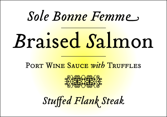
Tribute was designed by Frank Heine (2003), a German type-designer known for his affiliantion with Emigre, T26, ligatures, flourishes, stories, and experiments. He based this design on a photocopy of a type specimen from 1565, by the French type cutter Francois Guyot. He was "particularly attracted to its archaic feel, especially with settings in smaller design sizes. It is rougher with less filigree than the types of the following centuries thus exhibiting much cruder craftsmanship of the early printing processes." The lack of detail from such a specimen allowed Heine to combine the Renaissace Antiqua form while applying his own contemporary mark.
The alternative letters and ligatures within this font inspire expression of individuality, while maintaining a strong sense of quality and balance. I love the ff ligature; how the bottom of the second f is slightly truncated. Ah. Even if I were only allowed five fonts, this one might just make it to my list (okay, maybe ten).
Labels: typography
posted by J at 4.1.07
![]()

0 Comments:
Post a Comment
<< Home