Wednesday, January 21, 2009

Antoine et Manuel


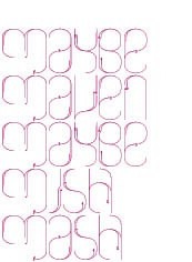
Antoine and Manuel are my go-to for graphic design inspiration. Awe-inducing, crazy-making, I never know what to expect - except that it will undoubtedly be new and challenging; I might even not like it - hello gold cardboard. It's that whole let's-do-this-just-because-it's-not-being-done-and-just-because-i-want-to attitude that I love. So French.

Labels: ,

Wednesday, November 12, 2008

Eco Graffiti


Moss typography! by El & Abe. Part of their manifesto reads: "We hope that not only the words will be noticed, but also the moss itself, put to the forefront through it's sculpting, fashioned into a form we can understand."

via Trendland, who are forecasting eco graffiti to be the next big thing. Tutorials are available, like this one at Instructables. Now I'm thinking of ways in which nature can be drawn ~ the possibilities intrigue me...

Labels: , ,

Monday, April 21, 2008

Daniele Buetti


I am crazy inspired by the artwork of Daniele Buetti (Swiss living in Berlin). Crazy inspired. It is totally glamorous yet thought provoking, commentating on fashion and advertising, beauty and identity. I would love to see one of these lightboxes in person - I'm sure they are a whole nother universe.

See more here and here.

Labels: ,

Wednesday, January 23, 2008

Posters


Tauba Auerbach has fun with type.

And - comments on a peculiar trend.

And - download MM Paris' 2008 Poster Catalogue.
It's crazy, beautiful, wonderful.

Labels:

Sunday, December 09, 2007

2008


Made me Laugh. 2008 Calendar designed by Noa Bembibre, titled: Cats Let Nothing Darken Their Roar. Available through Noa's website or Kiosk.

Labels: , , ,

Monday, November 05, 2007

Restraint


Let me first say, I have been waiting, almost obsessively, to see this gem. (checking the site everyday, rechecking just to make sure!) So, my heart skipped a little to finally read "It's ready!"

Restraint is an ornamental font that contains letterforms. It is a collaboration between Marian Bantjes and Tiro Typeworks. Read about it here. Buy it here. Watch the hours wile away.

Labels: ,

Friday, September 21, 2007

Lululemon


Fact. It is not possible to live in Vancouver without eventually purchasing something from Lululemon. I just bought my first pair of sweats there, and was frankly surprised I hadn't caved earlier.

Besides awesome yoga wear, they are also consistent with their philosophy. Everything (stores, graphics, people, etc) speaks about a healthy lifestyle, positive energy, friendly, fun, passion. This can be summed up in their manifesto (shown above). This image is also on their packaging, a reusable fabric bag, laminated on front and back. Ah, so much to love.

Labels: ,

Thursday, August 23, 2007

Flag Handmade


Was browsing old links and was happy to find this super fantastic window display. I now have an incredible urge to build big letters. Find it at Flag (Zurich), a graphic design duo hot for tasty type. Wander the site; this project is under the "handmade" button, lots of photos, a wicked van.

Also: a brilliant pile of letters on Ace Jet's found type friday.

And: I like this photo of big letters in the home. bold? fun? is this overdone? hmm. I'm undecided.

Labels:

Friday, August 17, 2007

Made Thought


I mentioned Made Thought (London) yesterday; they linger on my mind. I had to post again. Soooo what do I love about them (besides the fantastic folding letters as shown above)?

1. A simple website with strikingly gorgeous full-bleed photos.
2. Diagonal horizons, diagonal folds, slashes in titles.
3. A luscious gray background in all photographs.
4. New colour palettes.
5. White on white, black on black.
6. Large type. Yes! Go big!

Labels: ,

Thursday, August 16, 2007

Brand Drop


1. Nothing Something
2. Via Daily Poetics
3. Made Thought

I've been looking for ideas and inspiration for my own business card, and decided to post a few fishies from the pool. Also, here are a couple of resourceful sites on logos, brand and identity: Logo Orange and Identity Works.

Labels: ,

Friday, August 10, 2007

YFWD


You fuck. We don't. Well, that's one way of saying it! These guys are subversive, cheeky and totally talented. The collective is made up of Last-R, Drey and Nolenz, three young Art Directors in Paris. This is their avenue for personal projects, research and experimentation.

Labels: , ,

Monday, May 07, 2007

V&A


I've had my eye on the Victoria and Albert Museum lately because of my nearing vacation to London. But, I have actually long been intrigued by the V&A. While in school, constantly flipping through design magazines, one of the first identity systems that caught my attention was for the V&A. I kept thinking, what is this Victoria and Albert Museum? How did it manage to obtain such an awesome leading in design? A place so classic in it's subject, so contemporary in it's graphic identity? It didn't make sense to me. But, I loved it. And still, their logo is one of my faves.

Labels: , ,

Tuesday, April 10, 2007

TDC 2007


The Type Directors Club has listed the winners of the annual TDC competition, 2007. Some nice results here, some very unique. I like Fakir and Subtil. Kudos to Joshua Darden as well.

Another great site for type winners: Die 100 Besten Schriften. This is the most intuitive and informative font list. ever.

Labels:

Wednesday, March 28, 2007

Loveworn


Loveworn, I love. It is the work of Mario Hugo, who creates some especially inspiring displays of typography and hand-drawn lettering. Amazing detail.

He also has a great About section:

... I like to think of my work situationally - I don't want to be hampered by media or any particular style. My projects exist as their own entities, and I might work towards a variety of aesthetic, verbal, and conceptual ends.

I am available for freelance, commissions, and collaborations during the daytime, but my nighttime is reserved for artworks, children's books, and dreaming....

Labels: , ,

Sunday, March 18, 2007

Non-Format


I'm always inspired by the work of Non-Format, out of London. They always seem to be ahead of the curve... in their archives, I see a lot of what is in magazines today.

The image above is a typographic interpretation of music lyrics for Nas. I must admit jealousy. While studying for Communication Design, we were often given these awesomely experimental typography projects. While a good learning experience, rarely we were told, are these practiced and actually paid for. So, to see this particular project, published in Fader Magazine, reminds me that those dream projects do exist.

Anyway, besides that little personal note... Non-Format is also working the art direction of Varoom Magazine. Published 3x a year, it is defined as a journal of illustration and made images. And it looks full of grand.

Labels: , ,

Saturday, March 17, 2007

Tourist Type


Just ran into a wonderful Flickr set of touristy labels collected by Cotton Candy Hammer. I'm totally drooling over the above type of aesthetic; it's so classic and sophisticated in it's use of typography and colour. It's great inspiration for creating logos, and expanding them into an identity system.

I also love this one and this one and this one and many more, but I'll stop at three. By the way, CCH also has a fairly extensive flickr set of vinyl. This set is so appealing as a whole, with all the shades of yellows.

Labels: ,

Monday, February 12, 2007

Marian Bantjes


I have been fascinated by Marian Bantjes ever since seeing her work on the cover of Print Magazine. I was thrilled to find out she lives near Vancouver, and even more thrilled to see that she sends valentines! How could February pass without mentioning Valentines day?

Bantjes has an amazing portfolio. She has worked with Sagmeister and Fox River Paper. Most recently, her complex swirls have landed on a vellum poster for Design Matters Live. So Beautiful. I always look forward to seeing what she does next.

Labels: , ,

Saturday, February 10, 2007

Found Type


Spotted this sign on the door of a costume shop in Paris. I could not resist its innocence. More signs should be made of paint and paint brush... you only need one anyway.

Miscellaneous:

Things only have the value that we give them. -Moliere

Computer Love my new design addiction.

Beautiful Use and the amazing jewelry of swapee Heather Guidero.

Hunting for a better laptop bag...

Repainting the walls of my living room. Change of space, change of pace.

Labels: ,

Sunday, February 04, 2007

Le Labo


I love the branding efforts of Le Labo, a perfume line established in 2006. They have a very simple approach that emphasizes the personal experience of fragrance.

Their shop is more like a lab, opened to the public. You are encouraged to explore, smell the raw materials, and actually learn something. They blend your concoction, pour it into a glass bottle, and seal it at the time of purchase. They proceed to go the extra mile by stamping it with your name and an expiration date.

The scents are simply named. Neroli 46, for example began with Neroli, while 46 notes make up the composition. I find this refusal to be fussy and pretentious very appealing. They have also created signature scents for each city in which they are sold. These are not available by internet or phone. You need to travel to attain them. By taking these small steps, they are speaking against mass production and globalization. I do not see Le Labo being sold in supermarkets, with ads splashed in a celebrity lifestyle. They have really taken the slow approach to design.

Labels: ,

Thursday, January 18, 2007

The Geometric Modern Type


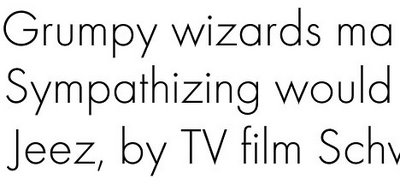
Futura. Ah, something of a love/hate relationship here. I have only recently begun to turn my head towards geometric modernist fonts. I used to think them awkward and disproportionate, never really melding together. Too many circles and sticks. But now I love them, especially the light versions. They exude an adorably delicate quirkiness.

The Futura typeface is also where “form follows function” all began. When Paul Renner first designed Futura (1927), it was radical and impressive. In its minimalistic appearance, constant line, and simple shapes, it was (and still is) the ultimate modern font.

Futura Facts:
It was the first sans made to be used as a text face. -- It is the only typeface that has been granted copyright as an original work of art. -- It has been the font of choice for Volkswagen since the 1960’s. -- It is the favourite font of both Stanley Kubrick and Wes Anderson.

The telltale sign of a geometric modernist font is the capital G, formed only by one circle and one line that intersects it.

Here are some other geometric fonts:
Geo Sans Light (free download!), Defused, Omnes, and Report.

Labels: