The Geometric Modern Type
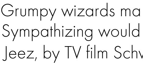
Futura. Ah, something of a love/hate relationship here. I have only recently begun to turn my head towards geometric modernist fonts. I used to think them awkward and disproportionate, never really melding together. Too many circles and sticks. But now I love them, especially the light versions. They exude an adorably delicate quirkiness.
The Futura typeface is also where “form follows function” all began. When Paul Renner first designed Futura (1927), it was radical and impressive. In its minimalistic appearance, constant line, and simple shapes, it was (and still is) the ultimate modern font.
Futura Facts:
It was the first sans made to be used as a text face. -- It is the only typeface that has been granted copyright as an original work of art. -- It has been the font of choice for Volkswagen since the 1960’s. -- It is the favourite font of both Stanley Kubrick and Wes Anderson.
The telltale sign of a geometric modernist font is the capital G, formed only by one circle and one line that intersects it.
Here are some other geometric fonts:
Geo Sans Light (free download!), Defused, Omnes, and Report.
Labels: typography
posted by J at 18.1.07
![]()
1 Comments:
I agree with your love/hate of (specifically) Futura. When it looks good, it looks very good, but when it's bad, well...
Regarding your planned trip the London and St Bride: I'd definitely visit but a word of warning: plan what you want to see. It's not so easy to "browse". There's lots of stuff in glass cabinets and behind the scenes but they have things you probably won't find anywhere else. Bet they've got interesting stuff on geometric sans serifs.
Post a Comment
<< Home