Monday, January 14, 2008

Cafe Revive


The identity for Cafe Revive at Marks & Spencer was created years ago, but I still think it's rather brilliant. Can this be a formula? Repetitive action becomes simple icon becomes pattern. Sometimes it makes sense, sometimes it just feels too trendy. But in this case, it's all fun, and it's perfect.

Designed by Graphic Though Facility (London). They are also the genius behind Habitat.

Labels: ,

Monday, November 05, 2007

Restraint


Let me first say, I have been waiting, almost obsessively, to see this gem. (checking the site everyday, rechecking just to make sure!) So, my heart skipped a little to finally read "It's ready!"

Restraint is an ornamental font that contains letterforms. It is a collaboration between Marian Bantjes and Tiro Typeworks. Read about it here. Buy it here. Watch the hours wile away.

Labels: ,

Tuesday, September 11, 2007

Ich et Kar


I know, I know, wall stickers have been everywhere for the past while. But I still think they make a nice solution for adding colour and energy to a room. The above stickers were designed by Ich et Kar (France), and can be found (along with a ton of other fun-loving designs) at Design 3000.

By the way, Apartment Therapy has begun their 8-Step Home Cure. I'm always ready for advice and inspiration to make my apartment cozier! Now sounds like a good time to jump!

Labels: ,

Sunday, July 29, 2007

Sol LeWitt


I crossed the wall drawings of Sol LeWitt a while ago, and they remain on my mind. Here is a great article released by sfmoma, which details LeWitt's ideas and process.

LeWitt stated the importance of reduction in the artistic process: "When an artist uses a conceptual form of art, it means that all of the planning and decisions are made beforehand and the execution is a perfunctory affair. The idea becomes the machine that makes the art." Supporting his idea that the thought is more important than the act, LeWitt rejects the notion of art as a unique and precious object. He often uses assistants to execute the works based upon his detailed instructions.

The above image is Wall Drawing #146, made with blue crayon. Call me crazy, but I totally want to do something similar to this on my wall.

Labels: ,

Friday, April 13, 2007

Gathering Colour and Pattern


This image of fabrics, colours and patterns has been floating amongst my boxes of stuff for a long time. For some reason, it never tires. It must be that girly-without-being-girly-girl type of aesthetic that I always love.

So, when I came across the Colour Palette Generator, this image immediately came to mind. Basically, the Colour Palette Generator takes any image from any website and pulls out a palette of corresponding web colours, both dull and vibrant (as shown in the second image above; the image is a scan from a magazine, elle decor uk i think).

To use the generator, you will need to obtain the url of an image from a website. How? "Ctrl-click" on the image, click on "properties," and it should come up with an "http//www.-site-.jpg" under "location." (This is for a mac, but is similar for pc).

To get a screen shot: shift-command-3. A Picture file will save to your desktop, which can then be opened in PhotoShop, if needed.

These are things I only recently learned, but have used them so many times since... how did I ever get along without them?

Labels: , ,

Friday, April 06, 2007

Wakerly and Barns


Was attempting to find content for a lovely little Easter post (unsuccessfully, I might add). Rose and Radish has a nice Easter section but what really caught my eye was their pic of Erica Wakerly's House Wallpaper. See more of her fabulous patterns here. I'm already trying to imagine where it could go: a feature wall, a side table, a subtle spot like a closet, hanging in a frame as art, wrapped around storage boxes...

Note how some of the houses look like M's!

And... WOW. I want to convert a barn. Found this essential guide on the website of UK's Homes and Gardens Magazine. and some barns here.

Labels: , ,

Monday, March 26, 2007

My Desktop


This has been my desktop wallpaper (on and off) for about a year now. I keep coming back to it. Why? It's simple and non-intrusive, with just the right amount of whimsy. I found it on the Celia Birtwell site. It's not immediately obvious... click on "2006 Collection," then click on one of the clothing items, then click on "wallpaper." Each item has a different pattern, each oh so lovely. (left: full height; right: detail).

Now, I am a little tempted by the designs at Desktopography. Seriously rich imagery. the kind that makes your imagination wander to far away places. all nature-inspired. all designed by designers. So my desktop may soon see the depths of a sweeping landscape...

Labels:

Friday, March 16, 2007

K Studio


I know, I know, this has been going on for a while now... but I love it and will post it anyway. Design Sponge has been featuring Sneak peeks into the homes of various great crafters, bloggers, designers... I always like to see how other people arrange and decorate and accessorize their homes. I especially love the home of K Studio, as shown above, and whose website is here. It's interesting to see how her fabrics and designs translate directly to her surroundings.

By the way, totally unrelated matter, I just fixed up my sidebar with some fancy schmancy Blogger Hacks. These things are a tad addictive. One of the features I added was the del.icio.us category cloud, which displays and links to all of my del.icio.us links. It's a tad overwhelming at this point, but I think as I begin to add descriptions to the links, it might make a fairly decent resource.

Labels: ,

Sunday, March 11, 2007

Security Papers


I love pattern. Any kind of pattern. The other day I came across Joseph King's flickr set of security papers, via The Style Press. I love the neutrals and blues and little shapes. The above sample has been called Dot Matrix Crosshatch. This is an ongoing project. Anyone can participate by simply emailing him a high-res jpg. I think I will spend a bit of time today rummaging through my piles of papers.

Speaking of pattern, I also just noticed the pattern on the white sleeve of my coffee cup, little debossed dots. So Sweet. Pattern is everywhere. Look closer.

Labels:

Sunday, March 04, 2007

Base Design


I always admire design companies that embrace the whole field. Base Design is one of them. Starting in Brussels, they now have offices in New York, Barcelona, Madrid and Paris. Read their profile. They do it all. They do it well. They live large.

I recently ran into Base's identity design for a MoMA exhibit, On-Site: New Architecture in Spain, and was intrigued. Each of the colourful cubes reflects a different component of the exhibit. They worked on all aspects of the exhibit, from invitations and merchandising to bus ads and billboards.

I also like the identity redesigned for Karen Karch, using high-impact typography, imagery, packaging and web design.

Their work is consistently bold and thoughtful, rare and inspiring. Explore their site; it's full of goods.

Labels: ,

Monday, February 12, 2007

Marian Bantjes


I have been fascinated by Marian Bantjes ever since seeing her work on the cover of Print Magazine. I was thrilled to find out she lives near Vancouver, and even more thrilled to see that she sends valentines! How could February pass without mentioning Valentines day?

Bantjes has an amazing portfolio. She has worked with Sagmeister and Fox River Paper. Most recently, her complex swirls have landed on a vellum poster for Design Matters Live. So Beautiful. I always look forward to seeing what she does next.

Labels: , ,

Sunday, January 28, 2007

Endpapers


I absolutely love the colours in this marbled paper (seen via the domino blog). What great inspiration. I am reminded of endpapers found in books lining old libraries and antique bookshops and flea markets. That smell of ink and paper. Everything faded, yellowed, pastel-coloured.

What are endpapers? They are the leaves found at the beginning and ending of a book. They are not only decorative... they actually serve a purpose. They lessen the strain on the book cover and hide all those raw edges. In some cases, the endpapers are the only thing holding the cover to the inside of the book.

Here is a great flickr set outlining slices of the process of bookbinding. I just love the art of bookbinding; the careful choice of materials leads to such a wonderful sense of touch and texture, outlasting any mass produced paperback by miles.

Labels: , , ,

Monday, January 15, 2007

To Touch


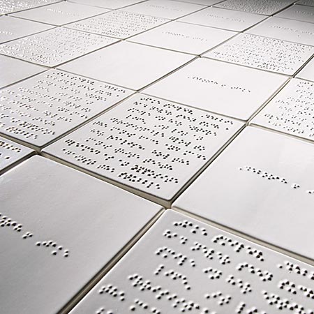
I have recently been caught by the fascinating topic of Braille in Design. Braille is now mainly used by blind people but the original idea was for soldiers to be able to safely read at night.

Braille is a reading system of raised dots. Named after its inventor, Louis Braille, the system's basic "Braille cell" consists of six dots grouped in two vertical columns of three dots each.

There are two different types of braille:
Grade 1 Braille is the most basic representation of letters. Several fonts are available for transcription of Braille 1, because it follows the standard alphabet and keyboard.
Grade 2 Braille, on the other hand, combines approximately 300 contractions. Duxbury software is most commonly used to transcribe Braille 2, where words like "and" or combinations like "th" are represented with one character rather than two or three. This style is more common because letters are about three times larger in Braille, so shortcuts help a great deal.

Braille has most recently been recognized on pharmaceutical packaging and signage. There was a great article from Ping Mag about accessibility and braille on signage and architectural elements. This Braille label maker is also a cool tool.

Products that incorporate braille into their design:
L'Occitane
M. Chapoutier Wine
Postage Stamps
Ceramic Tiles, as in the the above image

Labels: , ,

Friday, January 12, 2007

Ray Fenwick


I've been hearing a lot of Ray Fenwick lately, fellow Canadian, master of handwritten serifs. The kind that may actually elicit drool.

I was recently reminded of Ray while flipping through the current issue of Print magazine. But, he has long been building an online presence. You can find his wallpaper at You Work for Them, tees at Threadless, and some very inspiring works of graphic design and illustration at Co & Co.

And, drumroll please, he can be constantly admired by way of his flickr account, where there also sits (incredible, lush, throned) pages from the Hall of Best Knowledge. Just take a look. You will be amazed.

Labels: , ,

Monday, January 08, 2007

Gee Beauty


"It's time you were gorgeous." That is the motto of Gee Beauty, a beauty shop in Toronto offering every service from the "classic quickie" to the "red carpet," lessons for teens, and personalities like a "sean connery" for the guys.

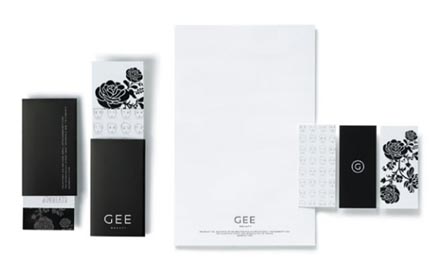
Not only do the services rock, but I also want to live there and assume their identity. The space begins with a cozy nook with white benches and little lattice, and enters into a a classic white, black, and mirror palette. This is perfectly indicated throughout their website and graphic image as well, as shown above. It was designed by gjp advertising and is perfectly and simultaeously classy and contemporary and inviting. Ah beauty.

Labels: ,