Wednesday, January 21, 2009

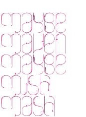
Antoine et Manuel


Antoine and Manuel are my go-to for graphic design inspiration. Awe-inducing, crazy-making, I never know what to expect - except that it will undoubtedly be new and challenging; I might even not like it - hello gold cardboard. It's that whole let's-do-this-just-because-it's-not-being-done-and-just-because-i-want-to attitude that I love. So French.

Labels: ,

Thursday, March 06, 2008

Kleenex & JWT


I know this campaign has been out forEVER, but I think it warrants a mention, as it continues to make me smile, even after seeing it a million times (and even though it may be totally choreographed). Yes I still love it. Why? They stepped away from those generic, safe guarantees that most commercials throw at us. This campaign says that viewers are emotional, and we want to experience and feel and share and connect. I think it hits a little deeper. But, at the same time, it makes sense for the brand. Tissue is naturally connected to crying. But it's not sad, it's a release.

The campaign was created by JWT. In reading about this campaign, the idea of advertisers as anthropologists kept coming up. I think this is a good example of that, although I am kind of tired of people in the design/marketing fields trying to rename themselves, creating bizarre titles.

Labels: ,

Tuesday, January 22, 2008

Dieter Rams: Ten Commandments


Source, and larger, more legible version here.

Labels: ,

Tuesday, January 15, 2008

Design Police


Made me laugh. Learn color theory. Ha. via Josh Spear

While we're at it, ruthlessly making fun of the less design-inclined, check out clientopia.

Labels: , ,

Monday, January 14, 2008

Cafe Revive


The identity for Cafe Revive at Marks & Spencer was created years ago, but I still think it's rather brilliant. Can this be a formula? Repetitive action becomes simple icon becomes pattern. Sometimes it makes sense, sometimes it just feels too trendy. But in this case, it's all fun, and it's perfect.

Designed by Graphic Though Facility (London). They are also the genius behind Habitat.

Labels: ,

Sunday, December 09, 2007

2008


Made me Laugh. 2008 Calendar designed by Noa Bembibre, titled: Cats Let Nothing Darken Their Roar. Available through Noa's website or Kiosk.

Labels: , , ,

Thursday, August 30, 2007

Mink Chocolates


Mink Chocolates is my new favourite Vancouver cafe. for so many reasons. 1. (obviously) hand-made chocolate bars to die for. 2. awesome quality coffee and hot chocolate. 3. you get a little chunk of chocolate with your cup o coffee. 4. a fondue bar! 5. their branding, the swirls, the colours are so luscious. 6. I just can't resist names like "Tawny and Ruby are Friends," "No Grumpy," "Open in Case of Emergency," "Certifiably Nutty..." and this cheeky touch makes them perfect for gift-giving. 7. their packaging: brown coffee bean bags, stamped with their name. 8. they live by the water. Ah...

Labels:

Sunday, August 19, 2007

Who Am I?


Playing with business card design... can't help but go back to basics: Who is my audience? What kind of image do I wish to portray? Who am I? What do I stand for? A big load for such as small space.

The above pages are displayed through an awesome tool called Pictobrowser. Post Flickr pictures by way of tags, sets or groups. It is miracle-simple.

Labels: ,

Friday, August 17, 2007

Made Thought


I mentioned Made Thought (London) yesterday; they linger on my mind. I had to post again. Soooo what do I love about them (besides the fantastic folding letters as shown above)?

1. A simple website with strikingly gorgeous full-bleed photos.
2. Diagonal horizons, diagonal folds, slashes in titles.
3. A luscious gray background in all photographs.
4. New colour palettes.
5. White on white, black on black.
6. Large type. Yes! Go big!

Labels: ,

Thursday, August 16, 2007

Brand Drop


1. Nothing Something
2. Via Daily Poetics
3. Made Thought

I've been looking for ideas and inspiration for my own business card, and decided to post a few fishies from the pool. Also, here are a couple of resourceful sites on logos, brand and identity: Logo Orange and Identity Works.

Labels: ,

Wednesday, August 15, 2007

Sandstrom Design


The identity system for Sandstrom Design (Portland, Oregon) is quite brilliant, with a website to match. I love the frank stories and simple layout. Their colour of the month made me laugh out loud.

Sandstrom was also the mind behind Tazo Tea, whose identity, packaging and website add up to be one of my all-time favourites.

Find the above image and a plethora of other letterheads, business cards, labels, tags... at Daily Poetics.

Labels:

Friday, August 10, 2007

YFWD


You fuck. We don't. Well, that's one way of saying it! These guys are subversive, cheeky and totally talented. The collective is made up of Last-R, Drey and Nolenz, three young Art Directors in Paris. This is their avenue for personal projects, research and experimentation.

Labels: , ,

Saturday, August 04, 2007

If You Could Do Anything


If you could do anything tomorrow, what would it be? I love this theme. I love this publication, which has just released its second issue. I wish I could get my hands on it. It showcases illustrators and designers, new and established, and parallels an exhibit which shows the originals. It includes some of my long-time favourites, like Mario Hugo of Loveworn and new favourites like Marion Deuchars.

And it all begs the question, if you could do anything tomorrow, what would it be? Hmmm....

Labels: ,

Friday, July 13, 2007

Diagonals


Been noticing a lot of bunched diagonals in graphic design lately; this was especially apparent in London. They were everywhere. I took this shot of some window for some sort of clothing shop (which one? I have no idea!)

Labels:

Monday, May 07, 2007

V&A


I've had my eye on the Victoria and Albert Museum lately because of my nearing vacation to London. But, I have actually long been intrigued by the V&A. While in school, constantly flipping through design magazines, one of the first identity systems that caught my attention was for the V&A. I kept thinking, what is this Victoria and Albert Museum? How did it manage to obtain such an awesome leading in design? A place so classic in it's subject, so contemporary in it's graphic identity? It didn't make sense to me. But, I loved it. And still, their logo is one of my faves.

Labels: , ,

Wednesday, April 11, 2007

Beckman's


I've seen paper folding before, I even have another post about it. But still, it draws my breath every time. So, of course, I was thrilled to fall upon this project by Olof Bruce, Tom Eriksson, and Liv Wadstrom. It is a pop-up book representing Italo Calvino's Invisible Cities. (I love Italo Calvino).

Anyway, the book was a student project while the three were studying at Beckman's College of Design in Sweden. The quality behind the work produced here is amazing. The courses cover advertising, graphic design, product design, and fashion. Even a quick glance offers a lot of inspiration.

One more quick note: I like how designers are embracing the idea of photographing their work in context, with people; it's informative, it adds an extra dimension, and it makes it more real.

Labels:

Sunday, April 08, 2007

Daniel Eatock


I like the work of Daniel Eatock. There is a frankness about it that's quite refreshing. He works a lot with words, groups and ideas. His Felt Tip Print was the first thing that caught my attention. It was made by repeatedly balancing a single A1 sheet of paper on the nibs of a set of Pantone pens. Colourful, sweet, and simple. I love to learn of alternate ways to create things and look at things.

I also stumbled upon the above project, My Favourite Cup. I would like to have a cupboard full of these. Besides funny, they would prove useful: to house pencil crayons or daily coffee or the warmth of a hot cocoa...

By the way, Eatock also has a great reading list on his site.

Labels:

Thursday, April 05, 2007

Add Magazine


Add Magazine describes themselves as A magazine on the subject of belgian design, mainly print, definitely crossover, upright content, for and by designers. Oh it's for free too. I would like to add: it is also readily available via a 300dpi pdf version, ready to download, anywhere, everywhere! (note the excitement!)

I came across this link by way of Pdf Mags, an entire site devoted to free pdf magazines. All magazines centre around the common themes of art, illustration, design and photography. This is such a great resource for independents and little gems.

Labels: ,

Wednesday, March 28, 2007

Loveworn


Loveworn, I love. It is the work of Mario Hugo, who creates some especially inspiring displays of typography and hand-drawn lettering. Amazing detail.

He also has a great About section:

... I like to think of my work situationally - I don't want to be hampered by media or any particular style. My projects exist as their own entities, and I might work towards a variety of aesthetic, verbal, and conceptual ends.

I am available for freelance, commissions, and collaborations during the daytime, but my nighttime is reserved for artworks, children's books, and dreaming....

Labels: , ,

Monday, March 19, 2007

Surface 2 Air


Another Design Studio I am inspired by is Surface 2 Air. This is their blurb: SURFACE TO AIR Paris is a creative studio/boutique operating in art, fashion and communication. Our need for freedom and independence, conditions to creativity, made us organize ourselves around high pluri-disciplinary activities and projects in the creative domains which interest us.

I am especially drawn to their work for Tsumori Chisato. Each season, they come up with such brilliantly detailed original colourful design direction.

Their work also introduced me to the amazing photography of Erwan Frotin, and of course the ready to wear collection of Tsumori Chisato. I always love to see such great talents working together.

Labels: ,