Friday, February 06, 2009

Evert Nijland


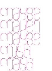
I am completely inspired by the work of Evert Nijland - I want to be completely surrounded by it - I want to dress like it, decorate rooms like it... it is so incredibly prefect.

via Another Shade of Grey.

Labels: ,

Friday, November 21, 2008

Mary Emma Hawthorne


Here is some serious collage love, by Mary Emma Hawthorne. I enjoy collages, not only because of their intricate quirks, but also because they inspire me, they give me great ideas for graphic elements and pattern - see - stitches, stripes in cirlces, paint splotches, ovals, italic caps... Via Love Made Visible.

Labels: ,

Thursday, November 20, 2008

This Colour


Art by Tom Burrows. Medium: cast pigmented polymer resin. Luminescent. I want to swim in it.

Labels: ,

Wednesday, November 12, 2008

Eco Graffiti


Moss typography! by El & Abe. Part of their manifesto reads: "We hope that not only the words will be noticed, but also the moss itself, put to the forefront through it's sculpting, fashioned into a form we can understand."

via Trendland, who are forecasting eco graffiti to be the next big thing. Tutorials are available, like this one at Instructables. Now I'm thinking of ways in which nature can be drawn ~ the possibilities intrigue me...

Labels: , ,

Friday, July 18, 2008

The Colours of Kozyrev


Sure, I love visiting sites like Color Lovers and My Pantone but, other times, I really think painters do it best. The above, most beautiful paintings are by
Dimitri Kozyrev.

Labels:

Monday, April 21, 2008

Daniele Buetti


I am crazy inspired by the artwork of Daniele Buetti (Swiss living in Berlin). Crazy inspired. It is totally glamorous yet thought provoking, commentating on fashion and advertising, beauty and identity. I would love to see one of these lightboxes in person - I'm sure they are a whole nother universe.

See more here and here.

Labels: ,

Wednesday, January 09, 2008

Revolt


I do not mesh well with history and politics, and cannot dive into a discussion about France 1968. I do, however, know impact and revolution when I see it. And it inspires me, even if not in the same way it was originally intended. The above posters are bold, fearless, raw, simple, created with true confidence. None of this subtle designy foo foo.

See more posters from the student revolt in Paris 1968 here.

By the way, loose translations of the above: be young and shut up/be quiet/be concealed (left) and he's the shit (right). Funny how these sayings have carried on and changed and become part of everyday language.

Labels: , ,

Monday, November 26, 2007

On Walls


Or, Wanting to be on my Walls.

Left to right, top to bottom:

• Lisa Congdon at The Shiny Squirrel.
• Michael Sowa (inspired by Amelie) at The Poster Shop. I often forget about posters, but really, all they need is a nice big frame and voila. I always love budget that doesn't look like it.
• Tapies Exhibit Poster at All Posters.
• Wilson Hsu at Thumbtack Press.
• Ashley G at Etsy.
ISO 50.
• Cole Gerst/Option G at Little Paper Planes.
• The Black Apple at Etsy.

Labels: , ,

Sunday, September 09, 2007

Verb List


Richard Serra, Verb List Compilation: Actions to Relate to Oneself

"When I first started, what was very, very important to me was dealing with the nature of process. So what I had done is I'd written a verb list: to roll, to fold, to cut, to dangle, to twist...and I really just worked out pieces in relation to the verb list physically in a space. Now, what happens when you do that is you don't become involved with the psychology of what you're making, nor do you become involved with the after image of what it's going to look like." (Richard Serra) Read more: Man of Steel

Labels: , , ,

Tuesday, August 14, 2007

Idea for Hanging Small Prints


I've been having a long-term love affair with small pieces of art. Gems from Tiny Showcase, Etsy, Art Magazines, Student Art Shows, Postcards, ATCs.... they're everywhere and they're often affordable. So I have this collection. Now what? I want to display some, I want to avoid frames, I want to enhance the textures and rough edges, I see a creative opportunity. So:


Materials: 12x12" sheets of wood, needles, hammer, hooks for back, some small pieces of art. To do: 1. Attach hooks to back of wood. 2. lay small piece of art in center of piece of wood. 3. Using hammer, lightly tap the needles into each corner of artwork and into the wood, just enough to hold it in place. 4. Once all four corners are nailed, lift artwork away from wood so it rests against the head of the needle. Art should rest about an inch away from wood. Voila! Hang on wall and admire your handiwork.

The above artworks are two of my personal favourites. On the left is the amazing Camilla Engman. On the right is a print I found in a little boutique in Paris. Ah memories. Makes my heart skip a little.

Labels: , ,

Thursday, August 09, 2007

LKSIR


"Listen to your walls!"

LKSIR (France) has a new project out there in the world. I love how the story develops and changes as you wander through the space. Explore his blog... it is full of gems, like the Eyeliner set. It's amazing; all about life and emotion and the best kind of craaaazy.

Labels: ,

Monday, July 30, 2007

Espira


Biography: "Espira is a London based visual artist who triumphantly mixes fashion, costume and uniform with the mundane and commonplace of modern life, resulting in a supermarket assault on the senses. Born in the UK, he was raised as a strict Mormon, developing strong visual interpretations of symbolism and iconography. This acclaimed Underground artist creates his work with a computer, using his own photographs of objects and models as reference."

Contemporary, relative, honest, violent, thought provoking, drool-worthy colour combinations... amazing.

Labels: ,

Sunday, July 29, 2007

Sol LeWitt


I crossed the wall drawings of Sol LeWitt a while ago, and they remain on my mind. Here is a great article released by sfmoma, which details LeWitt's ideas and process.

LeWitt stated the importance of reduction in the artistic process: "When an artist uses a conceptual form of art, it means that all of the planning and decisions are made beforehand and the execution is a perfunctory affair. The idea becomes the machine that makes the art." Supporting his idea that the thought is more important than the act, LeWitt rejects the notion of art as a unique and precious object. He often uses assistants to execute the works based upon his detailed instructions.

The above image is Wall Drawing #146, made with blue crayon. Call me crazy, but I totally want to do something similar to this on my wall.

Labels: ,

Monday, May 07, 2007

V&A


I've had my eye on the Victoria and Albert Museum lately because of my nearing vacation to London. But, I have actually long been intrigued by the V&A. While in school, constantly flipping through design magazines, one of the first identity systems that caught my attention was for the V&A. I kept thinking, what is this Victoria and Albert Museum? How did it manage to obtain such an awesome leading in design? A place so classic in it's subject, so contemporary in it's graphic identity? It didn't make sense to me. But, I loved it. And still, their logo is one of my faves.

Labels: , ,

Tuesday, April 17, 2007

Antony Gormley


I have been researching London like crazy lately (counting the days til I board my flight!)... finding great shops, design-heaven, eats, streets, artists, galleries... stuff beyond the usual. I will probably be talking about Brits for the next couple of months.

Along my journey, I came across the Southbank Centre which touches all corners of the art scene, from music to literature to the visual arts. They will soon be exhibiting the new work of British Sculptor Antony Gormley. Besides a selection of work inside the gallery, the exhibit will also feature sculptural casts of the artist’s body on rooftops and public walkways across central London, dramatically transforming the city skyline.

Labels:

Monday, April 16, 2007

Marci Washington


I found out about Marci Washington through her contribution to Tiny Showcase a few weeks ago. I checked out her site and found the above image particularly irresistible. Twould be perfect to fill one of my blank walls. Her inspiration: Currently I am interested in building a fictional narrative with connections to history as well as to the present. It's like I'm illustrating a novel that doesn't exist. If it did, it would probably be a lot like Wuthering Heights, Jane Eyre, or Bleak House- novels which function as social commentary as well as beautiful romantic epics. I love. Love.

You can also find her art on sale at The Beholder, a great site that connects artists with a larger audience, outside of the gallery system.

Labels: ,

Tuesday, March 13, 2007

Air & Veilhan


Air has recently released a new album, Pocket Symphony. The official album website is here. I'm no connoisseur of music, but I have been a long time fan of Air, maybe it's the rain, the slowness, the melancholy, maybe it's the "breathing life into silence using a simple range of delicate instruments."

I am often intrigued and inspired by album cover art. It's a good ground on which to break all the boundaries of graphic design, embracing experiment, play, art. For the cover of Pocket Symphony, (shown above, left), Nicolas Godin and Jean-Benoît Dunkel called upon French Contemporary Artist, Xavier Veilhan. Here is a fantastic collection of his work. His installations involve a wide range of media and technology, from photography and sculpture (as above right) to 3d scanning, lights, and digital imagery. Both musician and artist are fascinated by blurring the lines, between traditional and contemporary, sound and image, art and design...

The strangeness, innovation, focus on technique, complicated, beautiful, subtle, structure is all quite appropriate. Intrigue.

Labels: , ,

Friday, February 23, 2007

Julie Morstad


The amazing Julie Morstad is showing at the Atelier Gallery in Vancouver, opening Feb 24. The exhibit "Milk Teeth" includes thirty ink/watercolour drawings, plus new etchings and aquatints. A Must See.

Julie Morstad has been featured many times for her wallpaper as well as a sweet children's book titled "When You Were Small"

By the way... to enhance links, I've added SNAP. Just rollover any link to see an up-to-date preview of the site. I like to use it for my sidebar of 20 blogs; it's so easy to see if they have been updated. But... Obnoxious? Helpful?

Labels: ,

Thursday, February 15, 2007

Peter Callesen


The paper works of Peter Callesen are simply amazing. I am in utter awe of what he can do with a simple sheet of white A4 paper... the process of something so terribly cheap and mass produced suddenly becoming a story, a moment, fragile and beautiful. And little pencil marks.

I find the materialization of a flat piece of paper into a 3D form as an almost magic process - or maybe one could call it obvious magic, because the process is obvious and the figures still stick to their origin, without the possibility of escaping. In that sense there is as well an aspect of something tragic in most of the cuts. - P. Callesen

Labels:

Thursday, January 25, 2007

The Fluxkit

I have been a long time fan of Fluxus. Organized by George Maciunas in the 1960's, the Fluxus group worked in a wide range of media, from poetry to film, objects to events. Always questioning, always exploring and playing and defying. Unlike most art movements, Fluxus was concerned with bringing art into the everyday.

They created posters, stamps, playing cards, as well as boxes / Fluxkits (Spell Your Name With These Objects is shown above). Their methods were inexpensive, often commercially reproduced, and always encouraged the user to participate.

Sound familiar? Many of these methods are used today. Street art, guerrilla art, mail art, collage, zines, atc's... It's interesting to see that a very conceptual art movement from the past can be translated into something that is totally relative and accessible today.

Labels: ,